Showing posts with label Copic Marker Tutorial. Show all posts

Wednesday, April 13, 2011

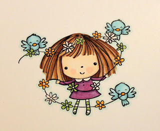
Coloring Mimi: A Copic Marker Tutorial

Hello!! Today I am sharing a tutorial on coloring. After I created the card for my Penny Black guest designer spot, I received several emails asking what colors I used to color Mimi (especially her hair)... and how I created the end result. So...I figured it has been awhile since my last Copic tutorial...so I would just create one to show you how I colored her. (Note: I think I used different purples for her dress on this card than on my previous card. I had already sent the card out and could not remember so I just picked new ones!)
Supplies used: Stamp- Flowers for Mimi (Penny Black); Paper- Pure Luxury by Gina K Designs; Ink- Memento tuxedo black pad; Copic markers-- Cool Shadow BG10; Egg shell E50; Blush R20; Dull Ivory E43; Brick Beige E31; Sepia E37; Dark Brown E47; Chamois E35; Lavender V06; Amethyst V17; Mauve Shadow BV00; Frost Blue B00; Ice Ocean BG72; Chrome Orange YR04; Golden Yellow Y17; Yellow Green YG03; Pea Green YG63
Here we go: I stamped the image on Pure Luxury cardstock with Memento tuxedo black ink: Next, I used Cool Shadow BG10 marker to outline the entire image. This shade gives a nice subtle shadow around the image and adds a lot of definition. It is important to do this step first so you do not smear any other colors you will use later coloring the image:

I used Egg Shell E50 to color the entire face and her hands. Next, I added some Dull Ivory E43 around the edge of her face and along the hair line and two circles of Blush R20 on her cheeks. You can see this on the picture below. (I would normally use some Dull Ivory on the hands where they touch the sleeves but in such small areas, I typically don't bother.) Then I go back to the Egg Shell and move the marker in a circular motion over all the new colors to blend them:

The Hair: The more colors you use, the more realistic and beautiful color you will get for hair. I love blending lots of colors to get a unique look. For Mimi, I used Brick Beige E31 to color the hair. I just put on the color fast, not worrying about hitting every spot since many colors will be layered on top:

I used Sepia E37 to color some strands of hair and esp. the hair underneath that would have natural shadow:

Then, I went back to my Brick Beige marker to blend the darker brown into the lighter areas, again working in a circular motion:

For a big more drama, I used Dark Brown E47 to add a few more darker strands:

Next, I went back to my Brick Beige to blend again and I also added some Chamois E35 for some highlights that I didn't blend (Sorry this picture is a bit blurry...you might be able to see better on the next photo):

To color Mimi's dress, I used Lavender V06:


Then, I added some Amethyst V17 to add some shadows:

Instead of going back to the Lavender to blend the Amethyst in, I chose some Mauve Shadow BV00 to blend the darker color in, using circlular movement:

For the birds: I colored them with Frost Blue B00:
Then, I added some shadow with Ice Ocean BG72:
I went back to Frost Blue to blend:
I colored the bird beak with Golden Yellow Y17 and then added a touch of Chrome Orange YR04:
I colored the rest of the birds the same way.


Then, I colored the stockings with Yellow Green YG03 on every other stripe:
I used Pea Green YG63 to add some shadow (and because the space was so small, I didn't bother to blend it):

I went back to the Golden Yellow and Chrome Orange I used on the birds to color every third flower on the flower strand:
I used the Yellow Green and Pea Green again to color the next flower and then I left the other flowers uncolored:

I used a Spellbinder's die to cut out the shape (sponged the edges with some sky blue ink) and added some metal dots to the flower centers:
Finished!


Instead of creating the same exact card, I changed it up a bit...and came up with this:
Total cutie Pie! Designer paper is by Echo Park.


Hope you enjoyed this tutorial. Feel free to post any questions if anything is unclear.


Have a great day! Thanks for stopping by!

Thursday, February 18, 2010

Anyone Can Color: A Copic Marker and Prismacolor tutorial

Hi everyone! At last....another coloring tutorial. I KNOW a lot of you have been patiently waiting for me to tackle another tutorial. I apologize that it took so long to get it done but I made sure to fill this one with lots of information. So many people have been asking what I mean when I say I colored an image with Copic markers and prismacolor pencils. So today's tutorial is focusing on that. I also used one of my favorite stamping techniques--paper piecing.

(I apologize for some of the wonky shadows that are in some of the pictures. I colored and photographed these early this morning and the sun was not cooperating. The pictures do show the colored steps just fine though. Just disregard the shadows!!!)

Let's get started:

First...I had to select an image to color. To me..the answer to this was pretty easy as I had several requests to show exactly how I colored these kittens after posting some cards with them.

I stamped my image three separate times in Memento ink. The cardstock colors I used are white, ivory and ocean mist. (Since I knew I was going to use the blue to paper piece the cup, I only re-inked that part of the image before stamping on the cardstock.)
Then, I got my colors together to color the kitten on the white cardstock. The Copic markers I used are: E50 Egg Shell, R20 Blush, E31 Brick Beige, E37 Sepia, B 95 Light Grayish Cobalt.

The Prismacolor pencil I used is raw umber.


First, I took my Egg Shell marker and colored the kitten. I colored most of the kitten but left a few white spaces around his nose/mouth area. There will be a lot of blending of colors and I just wanted to make sure these areas remain the lightest so I didn't bother to add ink there yet.


Next, I took my beige marker and added that around the edges of the kitten's face and body. You can see the contrast of the colors because I didn't blend the color yet.

Then, I used my Sepia (I think my "favorite" Copic marker of all) to add some darker, shaded areas. Note: I still didn't blend the colors at all yet. Just adding color at this point.
After I put down enough darker brown color, I went back to my beige and blended the Sepia using small circular motion. Do not blend it all across the image. After you blend the Sepia in...then you can go back to the Egg Shell and blend some more.


The key to lots of dimension is different shades of the same color. You want the shades you select to be in sharp enough contrast to each other so that when you blend you can create the hues in between. I chose to color the kitten using Egg Shell (as my lightest color); Brick Beige (as the midline color) and Sepia (as the darkest color.) Because they are definitely a few shades away from each other...the colors look strange when you first apply them but after you BLEND...they create wonderful dimension.
I always blend using the next lightest colors I used. For example, If I used sepia...I blended it in with the Beige...If I use the Beige...I blend with the Egg Shell.
Next, I used some Blush to add some pink to his nose, ears and cheeks.

I blended some more using Beige and Egg Shell. (Keep playing and blending until you are happy with the results!) Then, I used Light Grayish Cobalt for his eyes.

When I am content with how the copic coloring looks....I can then use my Prismacolor pencils to add more dramatic shading. For this example, I am only using my brown pencil to add some more shadows to the kitten.


After I lay down the color, I blend it with odorless mineral spirits by dipping the blending stump in the mineral spirits and moving it over the colored pencil in a circular motion. (Remember: only do this step after you are finished coloring with Copic markers. You can damage the tips of your markers if you get the residue from the pencil or mineral spirits on them.)

The kitten is DONE!
You may notice that I stamped the kitten a few times. I wanted to use ivory as my base for this image (because it will go better with the paper I am using on the rest of the card.) So....I take my stamped kitten on the ivory and go over the outline with G00 Jade Green and BG0000 Snow Green. I only used Jade where I wanted darker shadow (like under the saucer and by the handle.)


Next, I took the blue kitten image and added some shadows to the teacup using the same markers. (I tested these colors first on the blue to make sure they looked ok.)
I cut out the teacup from my blue cardstock and the kitten body from the white cardstock that I colored in the steps above and assembled them on the ivory cardstock. (Note: I did lay some beige color on the kitten on the ivory cardstock so that when I popped the kitten on top, you would not see white underneath.)
And here is what my assembled kitten looks like.

I didn't color the flowers because they will be hidden once I create a card from this.
Stop back tomorrow to see how I use this image on a card! HERE it is!
Materials used: stamp image-Purrr-fectly Delightful (Gina K Designs); cardstock-Pure luxury white, ivory, ocean mist (Gina K Designs); Memento tuxedo black ink; Copic markers; Prismacolor pencil.
I hope you like this tutorial and if you have any questions feel free to post them or email me and I will get back to you as soon as I am able to.
Thanks for stopping by!

Wednesday, August 13, 2008

Anyone Can Color---A Copic Marker Tutorial!

A few months ago, I did a tutorial on coloring with Prismacolor Pencils, which you can find here.
I thought it would be fun to do a new coloring medium every few months so......here is the short Copic tutorial I put together for those of you who want to understand a little bit better how Copic markers work.

I was fortunate enough to take the Copic Marker Certification class in Chicago a few weeks ago and so I thought I would take some of that information, coupled with my own experiences having played with the markers for over a year now, and compile a short lesson.

Copic markers are alcohol based markers, therefore they can do a lot more than your basic art marker. There are several types of Copic markers--including the original Copic, the Sketch markers, and the Ciaos.

I own a few of each type but I love the Ciao the best---why? Because the slim shape make them very easy to use and they are also the most economical of the group. Since the markers all have the same ink---finding the barrel of your choice is a matter of personal preference. However, you CAN change out the tips of the markers so if you would rather have the tip that comes with the Sketch marker (for example), you can always just buy one and change out the ones in your marker.

The Ciao markers have a pointed tip and a chisel tip. I use the pointed tip for all of my detail work and most of my coloring in general. The chisel tip is a fast way to apply a lot of color and I use this side mostly for backgrounds or to fill very large images.

Here is how I store my Copics! My father-in-law built me a new desk and an extra storage cube that sits right beside the desk. This is the top drawer of the cube. Other drawers house my other coloring tools. It makes it really easy to just pull a drawer out and work right next to it. And---I never have to pause in my work to replace the marker exactly where it came from. So this works great for me.


For this tutorial, I am using a stamped image from the Summer Harvest set by Gina K Designs. I stamped the image in Brilliance Black ink on Whisper White Cardstock (Stampin' Up!) and then I picked out the colors I wanted to use to color the image.


Again...the cardstock choice is a matter of personal preference. I know a lot of people like to work on the Neenah cardstock or even the Georgia Pacific, but I have gotten fine results with the whisper white so it is what I use. Find what works best for you!

Note: I keep a scratch piece of paper (in the SAME cardstock I am working with) next to me when I work so I can test color choices and clean off my blender pen. Using the same cardstock enables you to see how the color will show up on the cardstock you are using...makes sense?

I am working on my new Scor-Mat (that fits perfectly on top of my Scor-Pal--so it never has to get put away!!!) A must have for all Scor-Pal owners!!!

The colors I chose for this image are:
Pea Green, Olive, Lipstick Red, Lipstick Orange, Sepia and the Blender pen.


First, I used the lighter shade of green--Pea Green-- to color the leaf. It is important to note here that you should choose two shades of a color that are different enough to form a contrast. You do not want to use colors that are just a hair different or the shading will not look as dramatic.

When coloring the image, you do not have to make sure your base color is perfect. A few white spots or lighter areas are fine...and, in fact, desirable to get a good finished product.


Then, I took my darker shade of green--Olive--and went over the image in the places I thought would be some natural shadows...along the bottom of the leaf, near the stem and a bit by the vein.


Then, go back to the lighter shade--Pea Green---and in CIRCULAR movements move the tip over all the areas where the darker green meets the lighter green. The colors will blend beautifully and you will not see a harsh line anymore. NOTE: It is important to do this step while the first color is fresh (ie. not dry) so, when coloring an image like this, I would color two leaves and then go back to do the shading and blending and then go on to color two more, etc.


I am not finished with the leaf yet....but I am giving it time to dry before the next step!
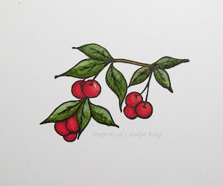
For the cherry....the same idea. I took the lighter shade of red and colored the image. Then, I added the darker red and blended with the lighter shade. For this cherry, I deliberately left a small spot without any color.


Here is the cherry with the darker color added to the bottom edge and blended with the lighter color:


Then, I went back and colored all the leaves and the cherries the same way....working two or three at a time:

Finally, AFTER THE IMAGE is dry I used my Colorless Blender to add some more highlights to the image. For this step, just take the colorless blender and remove color by coloring smaller areas where you would like a highlight. Unless you hold the blender on the image and push down hard....the ink removal will be slow so you can carefully remove the ink until you reach the desired effect you want. NOTE: Remember to write with the Blender pen on the scratch paper before moving to a new color so that you don't transfer the color you removed from the previous area to the next area you are working on.


Oopsie---I realized at this point that I never colored the branch. Hee! So I grabbed my Sepia marker and added that at this point.
Once dry, I used my Colorless Blender pen to soften the color in the middle of the branch.


Here is my finished product! Notice that even in the area of the cherry where I left off an area of color, that when I used my blender pen over it..it softened the look of it making it more like a highlight rather than a white spot.
This image is ready to be used on a card......


or....made into a magnet!
I purchased these Memory Frames and Memory Glass pieces last month and have been wanting to use them. I thought that this image would make an adorable refrigerator magnet. (In fact, I think a set of magnets using the fruit in this set would be such an adorable gift!)
Anyway...the Memory Frames that I purchased are Antique Copper in color and they have a little circular top for use on a chain or for a ribbon tie. I didn't want to use that part for the magnet, so I just used my heavy duty scissors and yanked it off. Since it is soldered on, it was not hard to remove!


After trimming my image, I cut a piece of red cardstock to put on the back on the image and then placed the image and the red cardstock inside --added the glass on the front and back and closed the frame (VERY EASY!)
I used some Scotch mounting tape to attach the magnet to the back of the magnet, which looks like this:


Whola! ........The finished magnet!

Materials used: Stamps- Summer Harvest (Gina K Designs), sentiment - Hey there Cupcake (Stampendous); Brilliance Black ink; Copic markers; whisper white cardstock (Stampin' Up!); Antique Copper Memory Frame and Memory Glass (Ranger); Foam mounting tape (Scotch); magnetic strip.

Hope you enjoyed this tutorial.
Thanks for stopping by!